Fireworks for New Year's

Resolving to be changed—by religious change

I’ve been doing the “year in review” thing over the last few days. As I look back on my year in media, the item that jumps out to me as the most surprising is a little video I made.

Y’all and others shared it enough when I posted it to Facebook in April that I felt the need to unpack it a bit in a subsequent blog post. I’ve been thinking about why it so caught people’s attention. Let me share two thoughts.

“U.S. Religious Affiliation, 1948-2017” by Kyle Oliver at prayr.cc/relig-affil (CC BY 2.0)

For one thing, visualizations are cool. You don’t have to be Edward Tufte to appreciate a beautiful graphic, and amcharts makes it relatively easy to create one. (Here’s my most recent amcharts handiwork.)

But as I think more about this graphic in particular, I’m guessing it’s the time series nature of the data that made it compelling. We have a name for what happens when you choose and share meaningful occurrences that unfold over time. We call it a story.

People cared about the graphic because it tells a story. It tells the story of religious change and a growing group who feel un-pressured to claim formal religious affiliation, or who actively renounce it.

This is a story that people of faith have a hard time not getting defensive about, even though plenty of research suggests it’s not (all) about us. It’s a story that religious leaders, in particular, find challenging—what with its potential implications for our livelihoods and all.

But I increasingly believe the defensiveness and fear only make matters worse. So as I write this on January 2, I’m adding a second New Year’s Resolution to my list. (Number One is dissertation related.)

In place of fear and regret about religious change, I want to cultivate curiosity.

Searching with others at flea market - a metaphor for religious change?
Photo by Phad Pichetbovornkul on Unsplash

In her landmark study of the religiously unaffiliated, Elizabeth Drescher writes the following, using her intentionally provocative term “Somes” to refer to the religiously affiliated (i.e., non-Nones):

my interviews with Nones as well as my conversations with many Somes make clear that most of us, regardless of how we see ourselves in terms of affiliation and unaffiliation, are actively attentive to and curious about each other’s spiritual or religious practices … For many Americans, the resources this curiosity brings to consciousness will find their way, directly or perhaps more obliquely, into their own spiritualities (p. 8, emphasis mine)

Our nation and the world are becoming more spiritually and religiously diverse. I want to treat religious change as an opportunity to learn, an opportunity to grow in my own faith and in my appreciation for the whole human family.

I’ve always been curious about others’ spiritual lives, but too often I’ve tempered that curiosity with shyness and fear. In some ways that’s been more true since I got ordained, wary as I am about how some religious leaders use apparent curiosity as a beachhead for coercion.

Heaven make me free of it. I want to learn to trust that my spark of curiosity is holy. I want to trust that I can interact with others in ways they will know to be genuine and respectful.

I want to read, hear, and see more about how people practice faith or make meaning. I want to be challenged to reflect on how it works for me and my communities as I encounter similar and different practices among my neighbors and their communities.

I suspect my new city will be a good place to let this curiosity do its beautiful thing, though Drescher shows (not altogether surprisingly) that the percentage of Nones is growing fastest in places we think of as very religious.

So if your hometown doesn’t yet feel like a likely place to be both challenged and nurtured by religious change – just give it a couple years.

Cover photo: Thomas Evans on Unsplash

Disclosure: This post contains Amazon Affiliate links.

Visualizing religious affiliation screenshot

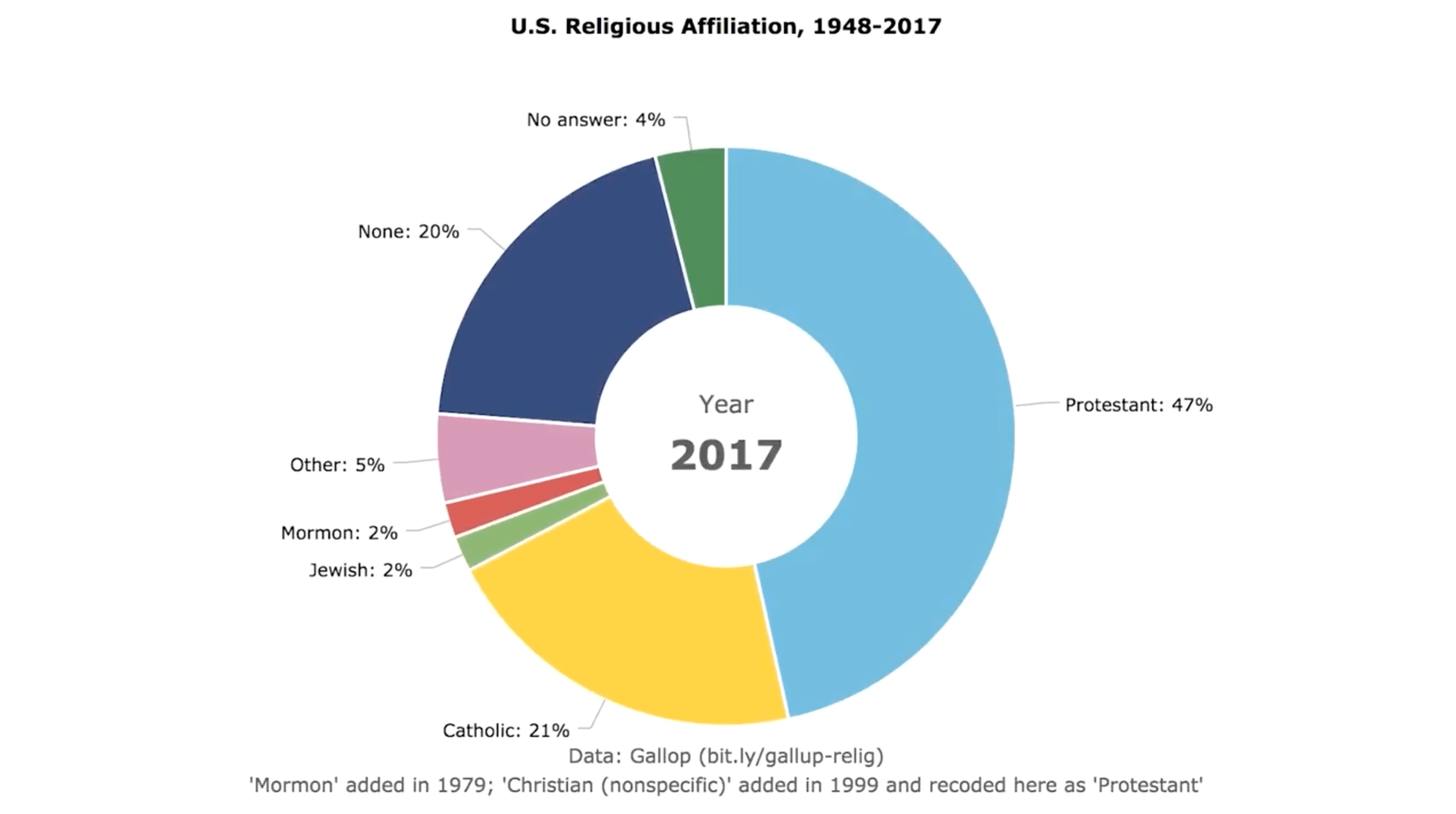
Visualizing religious affiliation over time

I’m currently working on a presentation about my research proposing that we more actively investigate alternatives to what I’ve been calling Sunday School As We Know It.

As a part of that work, I’m arguing that we need models that take more explicit account of religious diversity and work toward what Mary Hess calls a “community of communities” approach to faith identity (disclosure: affiliate link).

I wanted an easy visual way to capture the difference in diversity during that historical aberration known as the baby boom versus how things are today. I couldn’t find a graphic visualizing religious affiliation over time, so I made one:

Suggested attribution: “U.S. Religious Affiliation, 1948-2017”
by Kyle Oliver at prayr.cc/relig-affil (CC BY 2.0)

As I said on Facebook after this post really took off, the thing I believe we need to say anytime we look at affiliation data is they mirror pretty strongly the broader social picture that Putnam documented in Bowling Alone (disclosure: affiliate link). Dis-affiliation is a broad social story as much as, and probably more than, a religious story per se.

None of this means people of faith don’t have work to do, but it should shape for us the character of that work, in ways we’re obviously still figuring out. It also means it’s not “all about us,” which I take some comfort in.

If you’re interested in thinking more about all this, the best thing out there right now, in my view, is Elizabeth Drescher’s Choosing Our Religion (disclosure: affiliate link).

A few notes about reuse:

A few methodological notes:

  • I’m not a sociologist, of religion or any other kind. So take that for what you will in terms of my expertise for visualizing religious affiliation data.
  • The data comes from a Gallup survey covering these same years. I sampled every seven years except for 2017, which was the most recently available datapoint.
  • As I put in the little footnote, “Mormon” appears as an option in 1979. I don’t know how they coded that answer previously. I’m guessing as “Other”?
  • As I also put in the footnote, I recoded the “Christian (nonspecific)” category as “Protestant” when it appears in the data in 1999, just to simplify things. Obviously, this choice assumes that the vast majority of people selecting this category are Protestant and either don’t know it or don’t like the label. This seems supported by the fact that adding this category didn’t seem to introduce any discontinuity in the Catholic numbers. Complicating this, of course, is the likelihood that Orthodox Christians might prefer “Christian (nonspecific)” over “Other,” unless the interviewers make that choice for them. I don’t know if the Gallup codebook is available, but I didn’t investigate. To give you some sense of the scale of this latter issue: Pew currently puts Orthodox Christians at 0.5%.
  • I was as surprised as some of you that at least “Muslim” and perhaps also “Buddhist” and “Hindu” weren’t pulled out explicitly. My guess is that’s because each comes in at less than 1% (0.9%, 0.7%, 0.7%, respectively), again according to Pew.

Thanks for taking such an active interest in this graphic visualizing religious affiliation data! Let’s let this phenomenon spur us on to clear-eyed realism and action rather than anxious hand-wringing.