I’m currently working on a presentation about my research proposing that we more actively investigate alternatives to what I’ve been calling Sunday School As We Know It.
As a part of that work, I’m arguing that we need models that take more explicit account of religious diversity and work toward what Mary Hess calls a “community of communities” approach to faith identity (disclosure: affiliate link).
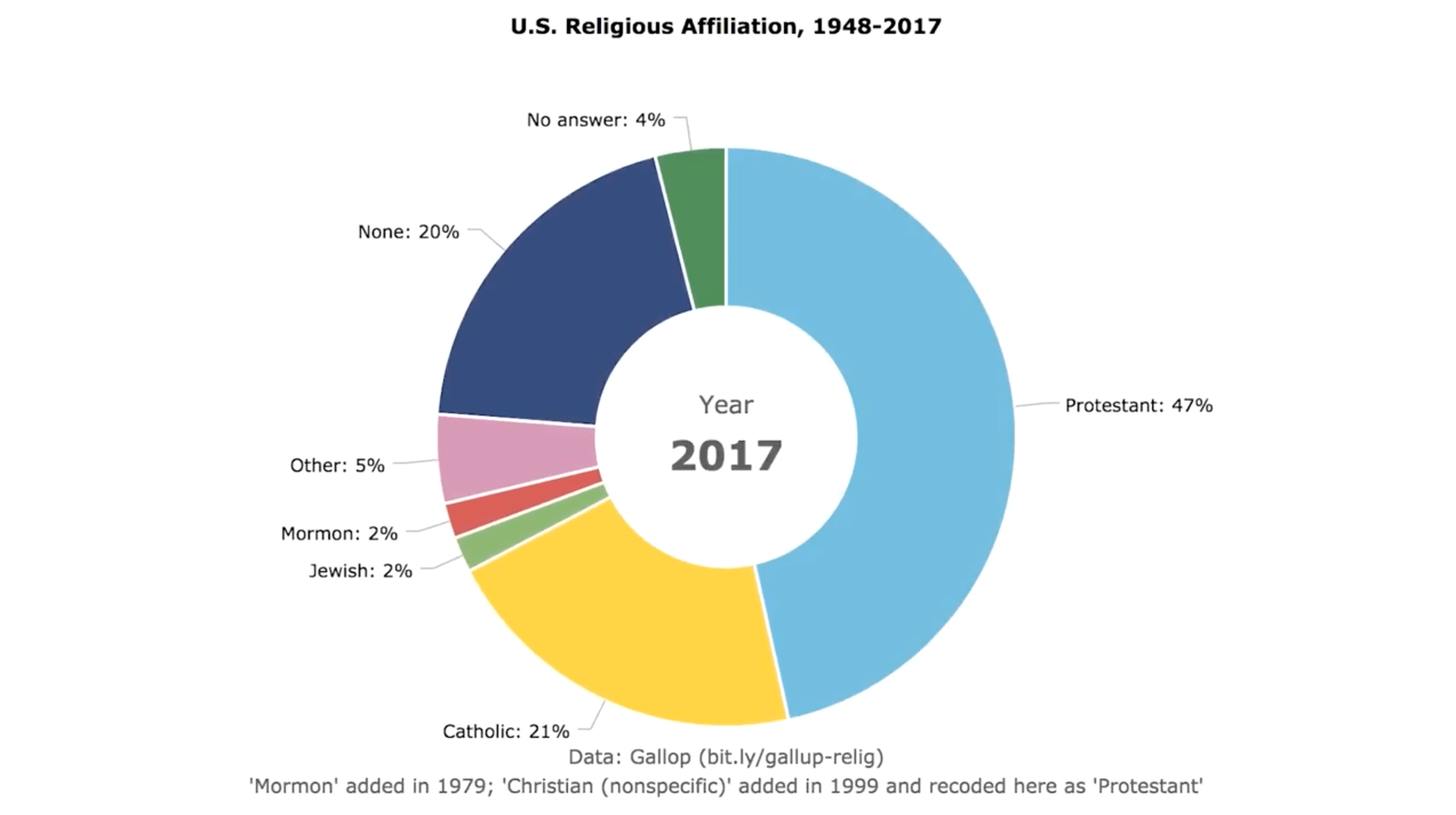
I wanted an easy visual way to capture the difference in diversity during that historical aberration known as the baby boom versus how things are today. I couldn’t find a graphic visualizing religious affiliation over time, so I made one:
Suggested attribution: “U.S. Religious Affiliation, 1948-2017”
by Kyle Oliver at prayr.cc/relig-affil (CC BY 2.0)
As I said on Facebook after this post really took off, the thing I believe we need to say anytime we look at affiliation data is they mirror pretty strongly the broader social picture that Putnam documented in Bowling Alone (disclosure: affiliate link). Dis-affiliation is a broad social story as much as, and probably more than, a religious story per se.
None of this means people of faith don’t have work to do, but it should shape for us the character of that work, in ways we’re obviously still figuring out. It also means it’s not “all about us,” which I take some comfort in.
If you’re interested in thinking more about all this, the best thing out there right now, in my view, is Elizabeth Drescher’s Choosing Our Religion (disclosure: affiliate link).
A few notes about reuse:
- I started from this demo template by amCharts, which is a pretty nice tool.
- I published the code on CodePen (as did amCharts), so you can remix it if you like. As you can see above, I’m publishing this visualization under a Creative Commons Attribution License. There’s more about Creative Commons and how to attribute licensed work over on my prayer website.
- One of you very kindly asked about payment. If you’re interested in supporting me, I have a Patreon page and a few other ways you can support my work or hire me.
A few methodological notes:
- I’m not a sociologist, of religion or any other kind. So take that for what you will in terms of my expertise for visualizing religious affiliation data.
- The data comes from a Gallup survey covering these same years. I sampled every seven years except for 2017, which was the most recently available datapoint.
- As I put in the little footnote, “Mormon” appears as an option in 1979. I don’t know how they coded that answer previously. I’m guessing as “Other”?
- As I also put in the footnote, I recoded the “Christian (nonspecific)” category as “Protestant” when it appears in the data in 1999, just to simplify things. Obviously, this choice assumes that the vast majority of people selecting this category are Protestant and either don’t know it or don’t like the label. This seems supported by the fact that adding this category didn’t seem to introduce any discontinuity in the Catholic numbers. Complicating this, of course, is the likelihood that Orthodox Christians might prefer “Christian (nonspecific)” over “Other,” unless the interviewers make that choice for them. I don’t know if the Gallup codebook is available, but I didn’t investigate. To give you some sense of the scale of this latter issue: Pew currently puts Orthodox Christians at 0.5%.
- I was as surprised as some of you that at least “Muslim” and perhaps also “Buddhist” and “Hindu” weren’t pulled out explicitly. My guess is that’s because each comes in at less than 1% (0.9%, 0.7%, 0.7%, respectively), again according to Pew.
Thanks for taking such an active interest in this graphic visualizing religious affiliation data! Let’s let this phenomenon spur us on to clear-eyed realism and action rather than anxious hand-wringing.